The source of this post is: the verge
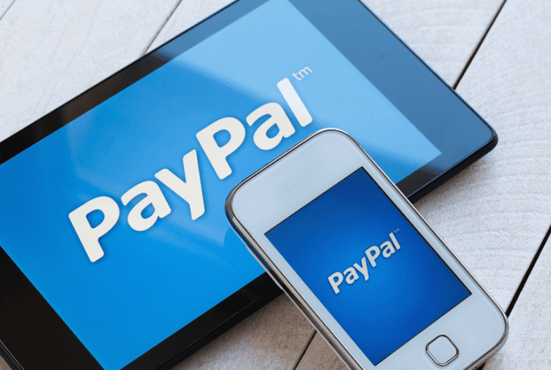
PayPal is not pleased with music streaming service Pandora, which last October debuted a new simplified logo with a design aesthetic similar to the digital payments company.
In a lawsuit filed last week, PayPal lawyers went out of their way to paint Pandora as a struggling has-been tech company with a terrible business model and waning popularity, according toGizmodo. The suit, filed in Manhattan federal court, says Pandora “has no path to profitability” and “deserted its longstanding logo and latched itself on to the increasingly popular PayPal Logo as part of its efforts to catch up to its competition.”
This particular tech industry beef is so interesting because of the alarmingly deluded self-image PayPal has cooked up for itself. Sure, PayPal is likely much more useful to the general populace as a payments app than Pandora is as a streaming service. That’s especially true given Pandora’s inability to keep pace with Apple Music, Spotify, and the scores of other competitors that have long since abandoned internet radio as the de facto streaming model. Pandora has since switched its focus to a premium streaming model, with a rather smart focus on the underserved country music community, but PayPal’s criticisms still stand, even if they are unusually harsh for a corporate lawsuit.
Still, PayPal seems rather too high and mighty here, thinking of itself as an “increasingly popular” brand, rather than that online payments processor that was inexplicably tied to eBay for 13 years until it managed to divorce itself in 2015. (PayPal’s subsidiaries would appear to have more brand cachet these days, as the company also owns the hip social peer-to-peer payments app Venmo.)
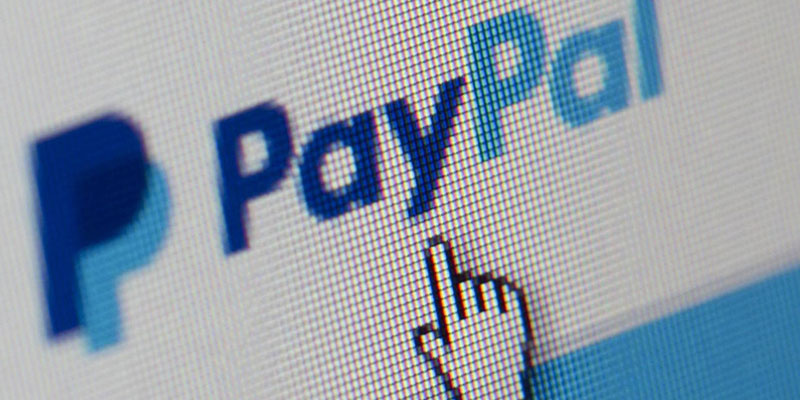
The two logos are indeed similar. Anecdotal internet testimonials on Twitter indicate people are in fact mistaking the Pandora app for the PayPal one, and PayPal’s legal team made sure to include many examples in its filing. However, PayPal’s own explanation for how to created its rather standard one seem a bit inflated:

It’s unclear how this is all going to play out in court, but PayPal is demanding an injunction against Pandora to stop it from using the logo on the grounds that its tricking customers into mistaking the one service for the other, especially on mobile. For poor Pandora, which just reportedly mulled over a somewhat paltry acquisition offer from Sirius XM, PayPal’s especially deep cuts over a logo redesign have to be salt in the wound for a company struggling to stay relevant.
GIPHY App Key not set. Please check settings